Saturday, December 31, 2011

Buku Hantaran: Green & Pink with Blings!

 This order came from a long time follower, she even wanted to join the book classes I conducted but due to circumstances she could not.

 And now finally, she's getting engaged! And naturally, she wants a folder of her own.

The first part of the request was blings! Lots and lots of blings. With light green and pink.

I have come to realise as much as I have the colours requested to start me off, I don't really know how the whole look will come together until I selected the base, and everything that goes along with it. In this case, I decided to go with the pink with white sakura print base, it had purple sakura too but that got hidden by the green and pink roses going on there. And the white sakura works well for the green heart gems I added on top.
Added more pink gems in heart and round shapes, and a darker shade of pink rhinestones. I used a large dark pink gem for the centerpiece as a highlight to all the pinks that is going around. The platform echoed the print that is happening on the inside of the folder.

Since I was already going with the sakura print outside, I decided to follow along for the inside, except it has a white base with pink sakura and green leaves. Just to add emphasis on the blings I put some on the inside covers too.
The folder came out pretty girly, and the client was very happy, and she's looking forward to her function that will happen beginning of the year so she can get the folder back for her to keep.

Thursday, December 29, 2011

Colours: The Meaning of Combinations in Feng Shui...

I only just learned this, it was too good not to share, extracted from Lillian Too - Feng Shui Master, also a belated Christmas greetings to all my fellow readers and followers in blogland, craftsville and artisans..

Wow - I just love all the bright lights and vibrant colors at this time of year - it's so energizing and uplifting! I was thinking today that the colour combination of green and red that we see everywhere now usually suggests Christmas to most Westerners... but to the Chinese feng shui practitioner green and red is the best colour combination for generating fame luck, popularity and recognition.

Yes, green and red is a combination that means success... green strengthens red based on the productive cycle of the five elements... wood feeds fire with power and energy. So here's a tip you can use long after the Christmas season is over... to bring good fortune to the family and especially success that benefits the sons in the family use the combination of green and red in their rooms after they have passed the age of twelve years. 

Which red color is best? The most auspicious red colours to use are cinnabar red, New Year red and ox blood red. 

Now if you're after money and successful business deals then silver and purple are excellent colors to use... because the words silver and purple sound like ngan chee in Cantonese which means money. So this combination - purple with silver has very powerful connotations for wealth luck. In fact, purple alone is a powerful and very prosperous colour.

Colours are very effective irrespective of which feng shui method you use and can be used in your home according to the location of the sector being decorated or based on your individual kua number. If you don't know your kua number you can easily find it by going to www.wofs.com and you'll find the kua calculator in the upper right corner of the screen. 

So... and a Happy New Year to one and all!!

Wednesday, December 28, 2011

Buku Hantaran: Green, Blue & Silver

 An A5 no fuss no muss folder

A request for a simple folder, green and silver initially. Then I asked for a third colour which was blue. Then the colour green got complicated, it was 'lime-green-but-a-tad-darker'... Looked around the environment for inspiration for that one, banana leaf green? Could it be...? Usually lime green is brilliant with yellow, I'm not sure which shade green goes with silver though, apart from emerald green, that would go with silver. But emerald green is no where near lime green that is a tad darker.


Confused much, totally.
Then I got another email, 'as long as it's green'. Ok, I can work with that. The rest of the request was minimal flowers, bow would be fine. Simple.

I have this particular stripy silk green with a blue undertone material which goes well with the particular blue I have paired up with before and decided to go use the combination. To add interest to the material I added gem hearts and rhinestones. To be honest I thought I was using white rhinestones as a family for silver, I only realised I used citrine yellow when I was taking the pictures. Oops...


For the silver component of the request I did a centerpiece with silver border and used the metal silver flowers for the center, using more of the gems to tie the whole look together.

I must say it's a totally different taste to what I usually produce, but it was also a nice challenge and I get to use a different type of flowers that had been knocking around my studio for so long I wondered if I ever will use them. And finally I have!

Monday, December 12, 2011

The First Public Appearance

One day I got a call from the Chairperson of the Brunei Library Association 25th Anniversary inviting me to be part of their Regional Conference on Library, Archives and Museums to give a presentation. Wow, I'm honoured that I got asked. The next question was, what do you want me to present? The answer was, anything I like. Ok, that was a bit odd of an answer I thought. Then the chairperson continued how she was impressed with my book works, the books and folders, I've been producing. She asked if I could perhaps do a demonstration or talk about my books and bring samples. So I agreed.

At first I thought maybe I could do a workshop, but I only have an hour slot and I didn't think it was enough time. Then I thought maybe I could talk about the bindings, that'll be different, everyone else is going to talk about the text and images printed on pages of books, I can talk about the structure of a book!

I had it all laid out, slides that shows the many other types of binding and structures, collected samples of books I've made borrowed from the various people who had bought or given that I could contact. Needless to say I was quite nervous and didn't know what to expect as the date I'm scheduled to be on got nearer and nearer. By the morning of the day I was to present that afternoon, I was wound up tight.

When I went to the International Convention Centre, I had my support system with me, my husband took the afternoon off from work, my toddler and my two cousins. We were armed and ready, all the books, book stands and pendrive in a bag. When we got to the ICC there was no sign to show the conference was held there. Made a quick call to find out if we were at the right location or not. Turned out the sign got taken down early and got directions to where we needed to go.

The place was quiet, probably because we were there early, and maybe because it being the last day so there wasn't that many people. I set up the books and waited for the lady who invited me. After a while she turned up and we exchanged pleasantries, and what I wasn't aware of was that I got lumped together with a presenter on archives. She started first and did an activity with the children and young adults that were present. My toddler decided to join in and she had a good time.

In between setting up and waiting for my turn, various people from the BLA came up to me and asked the same questions and I gave the same answers. By the time it was my turn to present, most of them had already heard what I had to say and it became quite informal. I was answering questions in between me explaining various binding methods and brief histories of each binding. The part that surprised them the most was that I did a Masters in this field and they were quite excited to try and persue further education. I also mentioned that I used to do a beginners book making class and they decided they would like to do the class too, and I suggested to them that I bring all the tools and equipment necessary and they just provide me a place for the class. So that is in the works.

All in all it was an interesting experience, it wasn't what I thought was going to happen but it being my first public appearance it was quite alright. At least now I know where to improve on my presentation the next time something like this happens.

The presentation came out in the local newspapers too which is a plus to see your name in the papers.

We ended the day of the conference by heading to the old British Colonial Residence, Bumbungan Dua Belas in town for an english high tea which was most enjoyable with friends who came to support me at the conference. It was a great day indeed.

Friday, December 9, 2011

Stab Album: Wedding Anniversary Red & Gold

 A client wanted something simple to put her wedding pictures in a nice album as an anniversary gift for her husband, and she chose the theme of red and gold to match her wedding outfit.

At first I thought I'll do a mainly red album with gold accent, after looking at pictures of her wedding outfit I felt it was better to have gold with red accents to balance the red out and to complement the pictures.


I had this really nice design paper where first time ever glitter looked really grand in my stash which I picked up from my travels earlier in the year. I thought it would look great for the album, and the sheets where the photo will be placed have a watermark of roses and daisies if one looks closely. It's getting harder and harder to find these type of paper now, they work so well for wedding themes and special occasions.


The end sheet has a faint print of roses in gold. Used a red satin ribbon to bind the album with a bow in the middle, and peridont yellow crystals with red gem flowers as accents on the cover.

I have plans to make smaller stab books using the same materials, I should've bought more, I only bought one sheet of this design and making this album already took up half. Nevermind, that's the nature of how I work, if it's all used up, that's it.

Tuesday, December 6, 2011

Buku Hantaran: Deep Purple

Close up of name plate with pink and purple heart shape gems around the names

I got this really nice email from Nadhirah regarding her order, and she sounded really sweet too. All she wanted was the base colour to be deep purple and use whatever other colours that I see fit, and she wanted it to be clean and neat, no bows. 

I got this great plan of combining deep purple with banana green and cream, a fresh change from all the purple and pinks.

I used a particular type of silk to get the deep purple base colour, and then I spied the floral motif paper, hmmmm.... it'll look great against the purple...
     
 Two folders, interior and exterior

So, because I decided to use the floral paper as end sheets for the folder, I had to follow the colour scheme from the flowers. Pink. I could've gone with blue but I didn't have any blue flowers. It's ok. The folders came out great, the busy-ness of the paper contrasted nicely with the deep purple, minimalist flowers and sparkly gems, a nice balance.

I actually had issues with doing the names, plan A didn't work as to how I expected so back up plan B came into play. All in all, folders came out great.

More pictures can be seen here.

Saturday, December 3, 2011

Buku Hantaran: Pop Up Purple & Silver

This is a tale about a last minute order, swallowing my ego and learning new things... And it goes like this...

I got an email one late saturday night, did I know about it, no, I was more concerned with not being at the hospital in time when one of my favourite aunt passed away.

Sunday morning after the funeral, my husband asked if I got the email. Um, no... Apparently, one of his work colleague texted him asking if I got her email that she sent last night. So using my cell phone I checked my mail.

An order for an engagement folder required 6 days later, of course by the time I read it, folder needed in 5 days. I could've said no, but it was because she wanted a pop up that I said yes to. I've been waiting for when someone was going to ask me for a pop up engagement folder and now someone have.
     
 Silver & purple engagement folder

Since she gave me her number, it was easier to call to discuss. She wanted purple and silver, but she wanted to see what sort of purple I was going to use. I don't know, it depends on what I have in my stash which I wouldn't be able to check until I get home, and since it was a last minute order, being fussy right now was not an option as far as I was concerned. But she still insisted and was very particular about her purple. So I said to her "Tell you what, why don't you look for the purple you wanted, and get it to me by tomorrow."

And she did.

What I didn't anticipate was when I received the materials (she passed them through my husband) a mix roll of fabric, crepe paper and florist paper, was the diagrammatic instructions!

What the...?!?! Yeah, my ego sulked for a while. Then I got over it and started working.

Close up of pop up flower

I did the best what I could with the materials not having used them before, I discovered a few things with how to use them to how I want them to behave, so that's a plus point. And overall I am pretty pleased how it turned out. Added on the blings and flowers to jazz it up to suit the occasion and I was done.

More pictures of the folder can be seen here.

Thursday, December 1, 2011

Buku Hantaran: Lilac & Silver


A sweet simple folder, if I recalled it was a 'no ribbons' order with their names. I decided to sparkle it up by using various shapes and sizes gems in shades of purple and white. Picture don't do it justice, it's prettier in real life as the light catches and they sparkles and shine...

More pictures can be seen here.

Tuesday, November 29, 2011

Wedding Guest Book: Concertina Girly Pink & Purple

Concertina guest book, all pink and purple

This was commissioned by a friend whos long time friend was getting married and she wanted to give a guest book to the bride for the wedding.

Conversation 6 months ago...
Sen: I want a guest book. Pink and purple. Make it girly. Bling it up too!
Me: Sure, no problem.

I used purple and pink through out. From pink pages to purple covers, pink and purple roses, pink and purple ribbons, and pink and purple blings in heart and circular shapes... All pinked and purpled out.

Close up of heart shaped gems detail

I was also really tired during this period. So looking at these pictures reminded me how tired I was, but I had to push myself to get this done as I had other orders waiting in line.

Then I noticed mistakes started to crop up, is it obvious? Can I fix it? Do I just push on?

I had to fix it, it was too obvious to leave it be, my QC is very high. Mental note, don't ever do that again, nip it in the bud.

Close up detail of pink and purple roses at the ends of the ribbons

I was very happy when I was done. Both sides of the guest book was decorated as it'll be used for two ocassions to reflect that. And my friend was very happy when I delivered it to her.

More pictures can be seen here.

Monday, November 28, 2011

Dos-A-Dos: Pink & Purple

Pink and blue back to back book 

One day a friend and I were talking, her mother in law birthday was coming up and she was trying to figure out what to get for her MIL who has absolutely everything. She was telling me how her in laws are really into books, as from her description, the house was packed with books as they love books. She mentioned how her MIL also kept journals, and she would use the old school text books for that.

'Ah hah!' moment.

Why not get a hand made journal? And there were other parts in the conversation that lead up to using images of the grandchildren as end sheets.

End sheet with grandchild no.1

Chose the pictures, fiddle around with Photoshop, and there you have it! A completely original personalised journal for the intended recipient.

Quite sweet isn't it.

More pictures of the book can be seen here.  

Saturday, November 26, 2011

Stab Bound: 6th Batch!


I actually lost track of how many batches I've been making, it wasn't until I was preparing the invoice when I checked what number I was up to. Goodness, six batches already, and that translate to 120 stab bound autograph books I have made for the school so far. No wait, 130 because the first batch was 30 books and after that 20 at a time.

Note to self, check when does contract making these ends.

Tuesday, October 25, 2011

Bento Fixation

Dessert Bento, made for a friend's birthday

I'm sorry, I have not been updating in a while, I am currently fixated making bento. Almost daily. For the past few weeks. It started off with a need to practice for when my daughter starts school next year she is required to bring packed snacks from home. My husband gets to have the bentos I fix for his lunch, his staff have come to expect his bento for the day and eagerly wait to see what sort of design I have done that morning.

It wasn't until when I got asked what motivated me to wake up early in the morning just to fix lunch was when I started thinking, good question aside from being the good wife making lunch for her other half. I worked out I enjoy the challenge. What can I do with this cucumber and I'll add it with a couple of cookie cutters. I use what tools I have to the limit of my creativity and I only have an hour to do it in from start to finish. I am fulfilling my quota of one illustration a day, and I'm doing it with food.

The kitchen has become Studio II.

I just hope I don't get a burnout...

Click here to go to the facebook album of Rozi's Bento Collection (so named by my sister as she's the one that uploads the pictures) I think you can leave comments as it's open to public... if not, drop me a message on the fb inbox or email and I'll reply back at ya!

Friday, August 5, 2011

Pop Up Picture Frames With Double Doors: More Presents

More pop up frames, more birthdays, these two are for a couple of the immediate family members, it was one of those, hmmm-I-haven't-made-anything-for-them moment, and thought of making these, maybe it could be something they can put on their office table...

I used the same pattern for the one I made for MIL, it being pretty and all and I just had enough to make another. And the person I'm giving it to said she likes pink and the various shades, so I figured this was just right.

 Of course, the nature of whatever wastage of paper left became the design for the pop up flowers. You can see it's different to the one I made for my MIL here.

 I had to do a cut and paste job to the pink flower just so I could get a complete whole flower, lovely design to work with, I'm debating on whether to get more...

 This one, I chose the print on the spur of the moment. Probably my brain was doing a lot of processing on whether it being suitable or not and calculations, but on the outside, you would just see me go to my paper stash, take out several rolls, unroll a couple, five minutes of staring, and off to the work table.

It was really a lovely print, one of those that you can frame up. What was left of the paper was the top half of the design, blue sky and all. Haven't thought of what I'll do with the leftover yet.

I hesitated with the back of the doors, whether the pink was too pink. When I look at the picture it worked pretty well...

What do you think of the pictures? I decided to try a different location taking the shots, lets hear your thoughts.

Have a great weekend everybody!

Monday, August 1, 2011

Wedding Guest Book: Concertina Red, White & Black

 One day I received a text message on my cell or mobile, whatever you want to call it, that asked for a guest book, red and white with a hint of black, and roses perhaps...

Out came the last of the beautiful embossed paper I had, my sister brought it back from the States a couple of years back, which I had been sparingly using, and now *sniff sniff* the last bits have been used up! *bawl*

The paper was pretty enough to stand on it's own, and detailing were only at the side where I used black ribbons with roses at the end.

Inside the guest book, it being predominantly white, there was a name to the paper I used, something like ice gold white I think, skinny black with red bows detailing to tie in the theme.

This was an accident, I was not aware this was going to happen, oh but what a happy accident, as the black red detailing were on both sides of the concertina, it created this when the book is propped open. Somehow it reminded me of garters...

Interestingly, the client who ordered this ordered it for a friend of hers who was getting married, and this client was an old client, one of my first few actually, so we're talking about at least five years here, and the past five years she kept my number! Amazing...

Saturday, July 30, 2011

Concertina Album: Simple white

Sheer white ribbon with silver detailing

A simple white wedding album for a simple couple. I was specifically told to keep it plain and no three dimensional decorations. None. At. All. What. So. Ever. But keep it wedding like. After I was done, I was tempted to put blings. Spartan like, here and there. When the client came and I mentioned I thought of putting blings but decided not to, she was so happy I didn't.

 
Portrait and landscape concertina albums

Usually when I do these sort of albums, the pictures are at least 5 by 7, 6 by 8, 8 by 10 even. This was a first using 4 by 6 images... that's what the client came with. Because each panel are to hold four pictures instead of one, the work load increased by 4!

The material I used have hibiscus design, a tropical flower, which I thought was appropriate as the couple have stayed in Brunei when they were children and they met in Brunei and the dress the bride wore was a top she had when in Brunei and the mother added on a skirt and modified it to become the wedding dress. So there is a lot of Brunei in this album. And the album is made in Brunei by a Bruneian! I used the word Brunei six times in this paragraph... 

Sorry about the pictures being slightly dark, I was rushing to get them done before the client came because I totally forgot I haven't and I could've photoshopped them but with the whole neck sprain thing happening, photoshop is not happening.

Sunday, June 26, 2011

Dos-A-Dos: Oriental Blue & Gold

After a long while, I've finally gotten around making a book! Long stitched binding using a maroon book binding thread, using a pretty blue oriental patterned japanese paper with gold for the covers, and a red with gold strands handmade paper as end sheet on the inside, lovely contrast.

Oh, and I've cut windows in the spine of the cover so you can see the book block as an added interest.


So this book, is off on a plane to Singapore as the client wants to give it to her long time best friend who had moved to Johor, Malaysia.


Books I've made get to travel to more places than I do... Amazing...

Friday, June 24, 2011

Bento: Charaben!

With baby's first birthday coming up, I wanted to give something to her first classmates (she goes to a weekly 'Sing and Sign Language' classes since March for the past 12 weeks) to mark the occasion of her first birthday. At first I thought a pretty cupcake of a sort. Then it got me thinking how my baby can't have it (not for a few years at least) and I feel bad if I'm feeding my kid sugar, and equally if I'm feeding other peoples kids sugar. Empty nutrients kind of thing when they are at the stage of needing the good stuff for their development, ok enough of that,it's just me, new mom syndrome...

And that's when it struck me to make bentos for them! Last time I made bentos was when I was in my first trimester, every time I look at the pictures of those bentos I made, I remembered how sick I was all day, I didn't have morning sickness, I had all day sickness!

I did research on kids bentos and preschoolers bentos, what they eat, how to make character bentos and looking at hundreds and hundreds of pictures of bentos.

I laid out a plan and did a sketch of what I would put into the bento. I made a test bento the day before, as I wanted to make them fresh for the actual thing and I needed to know how long it would take me to do them.


What I didn't anticipate on was the time it took to make them all, I thought I had simplified the design, the preparation took ages, but once the items were all ready, it was just a matter of putting them together.

Pretty satisfied how they turned out, cute, colourful and healthy. The only thing processed was probably the bread and that was wholemeal.

I don't know if each child we gave them out to enjoyed it, the mommies were impressed. Dropped one off to dear husband, who showed it to his colleagues and they can't believe it was edible, baby and I shared one together. It was interesting making them, but it won't be something I'll be repeating anytime soon.

More pictures can be seen here.

Buku Hantaran: Purple & Gold

This was order from a client, I would say she took the whole package, hantaran pertunangan, buku hantaran and menerima berian (engagement dower and dowry, engagement book and soon the receiving dower and dowry we're currently working on due in a couple of weeks time) of course all the hantaran (dower and dowry stuff) are made with my friend Heidi.

Anyway, the client, a sweet girl, requested for an A4 folder with a purple and gold theme. She also let me know other things she liked which was helpful. Purple and gold is a very royal colour combination, have to do it justice.

Fortunately I happen to have in my stash this purple with gold prints on it. Perfect! After I had it on the folder, I got stuck. It sat on my table for a couple of weeks until I decided on the fastening, and how to go about hiding it and everything else came into play.

There were almost 100 elements that needed to be stuck down individually. But it worked. It helped added some punch and a contrast to the pale gold in the background. I love how the tassels came into play. Not realising it while decorating, the print on the paper helped give a theme to the design, it had an oriental feel, the colour, the gold heart shaped gems, the tassels, the diamonds, I'm really liking this one, the print had spoken to me that was the direction it wanted to go. Good thing the inner me listened...

Pop Up Greeting: Presents For The Inlaws

The SIL, FIL and MIL birthday presents for 2011

I'm trying to catch up on posts here...

What do you give for someone who has everything they need already? I don't want to get a present just because it's a present, I'm the kind of person who cares enough to puts effort and time into a gift. And I'm fortunate enough to have the talent, skill and experience to make these for the inlaws. I figured this was perfect, there was no picture of their first grandchild and niece in the house yet, and this way I can personalised each one to them. I had help from the SIL to get the pictures done for me, and she helped chose which print to use for the parents, I have already finished hers so she had no say, haha.

Gave their presents for the year early and belated during my daughter's first birthday celebration, and they are proudly displayed on the shelf. You know it's a compliment when people asked where did they buy them. Interestingly enough everybody liked the MIL one, it was the most tedious and simplest one to make. I thought of making more of those...

More pictures can be seen here.

Wednesday, May 25, 2011

Background Happenings

Not to say nothing has been happening in the studio, more along the line of I can't remember where I last placed my camera so no new pictures until that is found...

The studio have been abuzz with activity, past several weeks my cousin and I have been using up, or trying to, all the stuff that had been accumulating and recycling other materials as well. We have been talking about this for ages and finally got your butts kicked into gear. We are making items to try and raise money on behalf for the Animal Welfare Foundation Brunei and Care and Action for Strays, two charities run solely by volunteers who care enough to do it. My cousin and I are more on a freelance base, why wait for something to be organized when you can start it yourself? We're being proactive, someone has to do something.

What I like about these activity of ours is that it starts off with a studio clean up! Yay! Yes, it has looked like a bomb had hit it, and now, thanks to my cousin's OCD of everything must be tidied I can see the floor again and it's safe for baby to crawl around now that she's mobile.

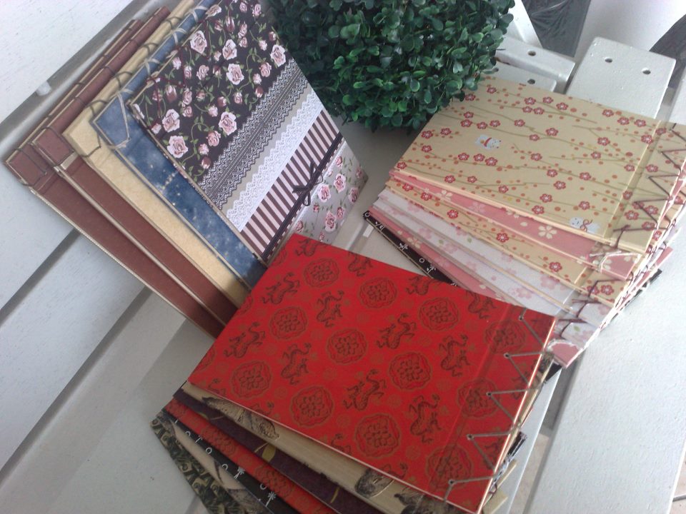
So we're donating our time, skills and whatever that can be used in the studio to produce mainly greeting cards of various types. I try to do as much as I can in between taking care of baby and cooking lunch for the masses, as sometimes there can be up to 8 people in the house, when it's normally just me, hubby and baby.

On top of selling whatever we make I've been pulling out things I've kept which I'm not interested in anymore but too dear to throw out. Those we repackaged, slap on a price tag and sell, cultural things that I've collected throughout my lifetime that I now want to let go, unique things which I can't remember where I've picked up, all in the name of trying to raise money for the unwanted animals vet fees.

I hope to say I think after several weeks we have made a dent in the mass that is the studio. Bags of old greeting cards and calendars that have been waiting to be recycled are slowly disappearing as we have gone through them. I can get to the shelves without having to do fancy ballet moves to try not to step on things. I am eyeing the amount of scrap materials that I know is useful but don't have the necessary skills yet to turn them into something fantastic that we can sell off. And I could finally see the table that my work station is on, with lots of cursing from said cousin as she cleaned, tidied and organized and lots of 'how could you let it get into such a state', plus point, she found money buried underneath all that! Yay! It's like digging for treasure, hahaha...

I can't have things placed neatly away in boxes and containers that I can't see through. And when I start working everything is on the table until whatever it is I'm working on is done so they are within reach. It's when I have multiple things going on at the same time is when the table hit critical mass, and that's when I loose control of the situation. But I can still work. I can still find whatever it is that I'm looking for. When the studio goes through it's periodical clean up when the cousin turns up i when she'll be on speed dial for a while so I can ask her where did she put the so and so until I know where everything is again.

I have discussed this state of having the studio getting into a state of disorganization with friends and fellow arty friends and they say it's not a bad thing, it makes the place look lived in, that there has been some creative process going on and it's not so sterile and unworkable in if a studio is too tidy. It boils down to we like to create, we hate to clean up because cleaning up waste precious time when you can create! Oh the logic we inject in! Lol...

Anyway, just to let you know that there is something going on in the background, and I am working on various commissioned orders I have received and that baby is growing up and I feel compelled to spend more time with her and my other mundane activities that I have to do, blogging have slipped somewhat. So when I do finally am able to remember where I last put my camera I'll post up pictures.


Tuesday, April 12, 2011

Buku Hantaran: Pink, Purple & Gold

These are my current favourite! I like how neat and tidy it looks. I love how considerate the client was for giving me ample time (she informed me two months prior to the event) and how nice she was when I called her up so I'm clear as to what she wanted. How easy I thought it'll be to get the colours and style...

Everything checked apart from that last line. I hunted everywhere! In the end, I had to go another route to recreate the fancy swirls that she wanted. It was pretty unconventional because I was using a material which I have not tried before and I wasn't sure how it would react with the glue but it was worth a try.

And it came out gorgeous! Because of the layering I was able to achieve that rich subtle look in and out of the folder. The roses scattered around the raised name plate ties in with the watermark rose their name was printed on in gold.

The fastening I used was much tidier and it need not be incorporated into the design, like how I'd normally would use ribbons and bows as fastening and have to figure how it would look to the overall design, so with the fastening I used on this one, you'd hardly notice it.

When the client came to pick them up and saw them, she loved them! I'm glad the folders have reached her expectations. It's always nice to chat a bit on how the wedding preparation is going, and she was a bit nervous as it was only a few days to go from when she picked up the folders. I told her everything will be well, just be positive and relax and enjoy the big day...

More pictures of the folders can be seen here.

Tuesday, March 29, 2011

Sneak Peak.....

Totally loving this one! Love love love! That is... until the next piece I'll construct, hehe... More pictures and story on next post when I'm free...

Interested?

Contact me at rzyunos@gmail.com